

|
I decided to do this week's blog entry on fonts. I haven't ever really given it much thought and I always went with Times New Roman or, if I'm feeling adventurous, Arial. Sometimes bold, sometimes underline no real use for italics unless it's for citations- but that's it. I don't typically stray from these staples since I feel like they are professional looking and I haven't had a need to try something else. Maybe I'm lacking creativity. Last week - and in previous weeks - during class, people seemed to swooooooooon over some of the fonts used and I figured this week's entry would be a good opportunity to look over this stuff and see what all the fuss is about. After doing some reading, authors have written about how fonts can attract readers, how they can inspire creativity and how emotions can be delivered through various forms of typeface. The tone is important and I feel like the reader will be drawn to information that's bolded or indented. I always thought that less is more and that some pictures, centred headings and clear spacing would be most attractive to the reader. Depending on who your audience is will dictate what your end product should look like. If you think about different fonts that you see on a daily basis, you'll know and recognize them and associate them with a certain product or company much the same as you recognize a team's logo. You know what the Rider logo is, but you'll also associate their font with the team when you see it..Sometimes bubbly, or jagged fonts will appeal to younger, energetic group and script will garner the attention of sophisticates. I think I'm happy with my blase fonts but can appreciate when people use a variety to mix it up. Maybe I'll try it sometime, but I don't think I'd use this script at the risk of offending my aunt..... 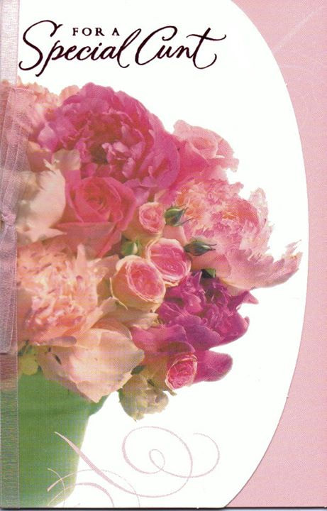
4 Comments
Leah Schmidt
3/4/2021 01:40:03 pm
Hi Darcy, 3/5/2021 07:21:57 am
https://www.m3.agency/news-insights/the-importance-of-choosing-the-right-font
Dylan Johns
3/5/2021 11:47:24 am
I agree, great post. I have been struggling with finding articles about mental health, online assessment and pandemic learning, but your choice of looking at fonts was more valid to me than most of the articles I have read lately! Nice work.
Darcy, I had never even thought to explore this topic, but a great topic indeed. Although I have never created an example like the one you have provided, I have also never thought in detail why I choose to use the fonts that I do. I love fonts, I breathe fonts, I feel as if I struggle when my documents don't look the way I want them to, but I have never put thought towards why I do it. That's interesting to me, and it has made me think more about why I do what I do. I think too, it can be more of an OCD thing for me. I also update assignments that I create so often, as I have learned something new over that time, or fonts have changed, etc. and I am always reworking already completed things. Maybe this is a topic I need to think more about. Why am I so font and aesthetic focused? Why does it matter to me? Leave a Reply. |
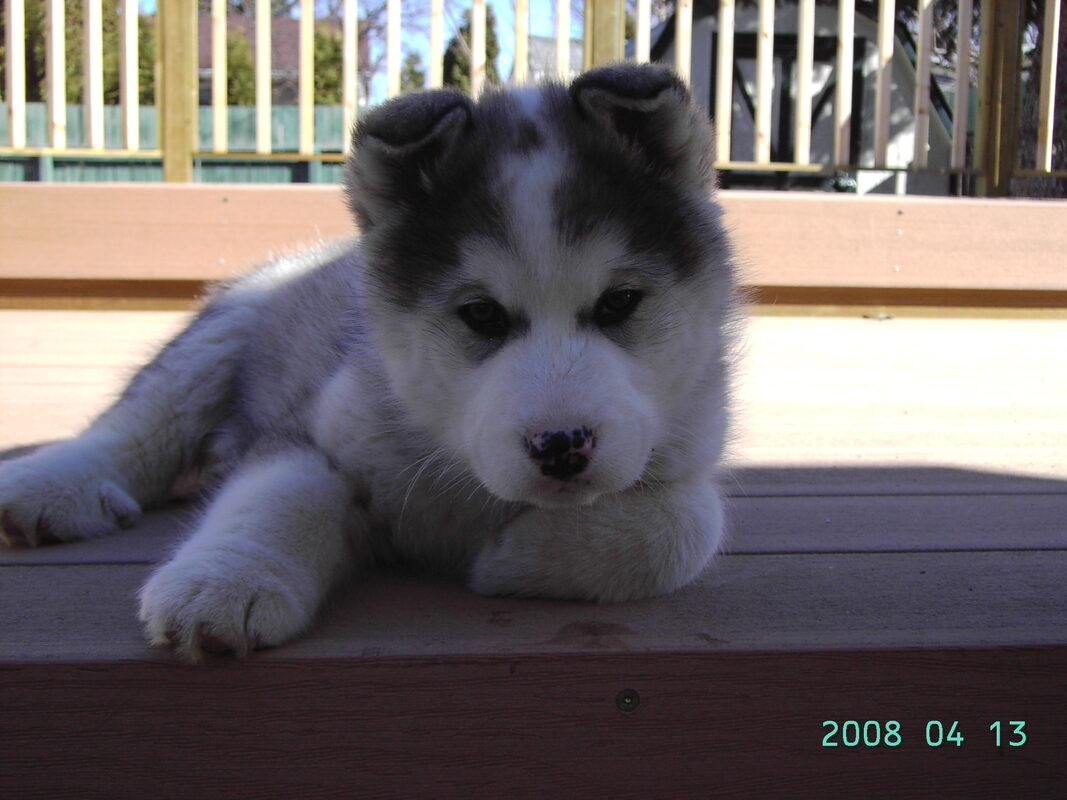
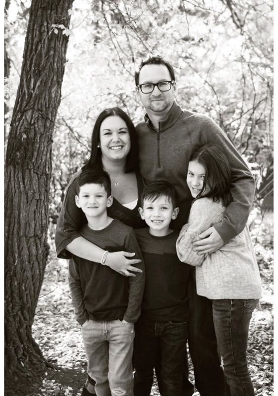
AuthorI am a high school physical education teacher. I have 3 wonderful kids Callie, Andrew and Jonah, a supportive wife, Larrah and an immortal dog, Xena. Archives
March 2021
Categories |
 RSS Feed
